


You are here:
>

Visual identity
Give your project a distinctive presence
A visual identity expresses the world of a project beyond a logo: an exhibition, festival, event, launch, or temporary venue. It creates a recognizable, cohesive, and immediately evocative presence across every touchpoint your audience encounters.
At Advisual, we design visual systems shaped around your context, spaces, and audience. Color, typography, imagery, signage, patterns, and layout work together to communicate meaning, guide visitors, and create a memorable experience.
The advisual method
1
Connect
Understand your context, needs, and ambitions.
2
Define
Set a clear direction to guide every decision.
3
Create
Shape the project through bold, relevant ideas.
4
Refine
Present our choices, then lead the last adjustments.
5
Produce
Finalize every detail, whatever the medium.
Selected works
A glimpse of what we create
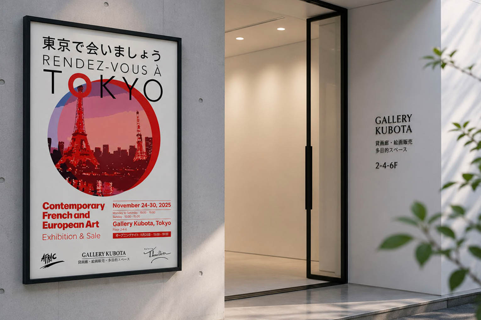
Rendez-vous à Tokyo art exhibition (Japan)
Visual identity
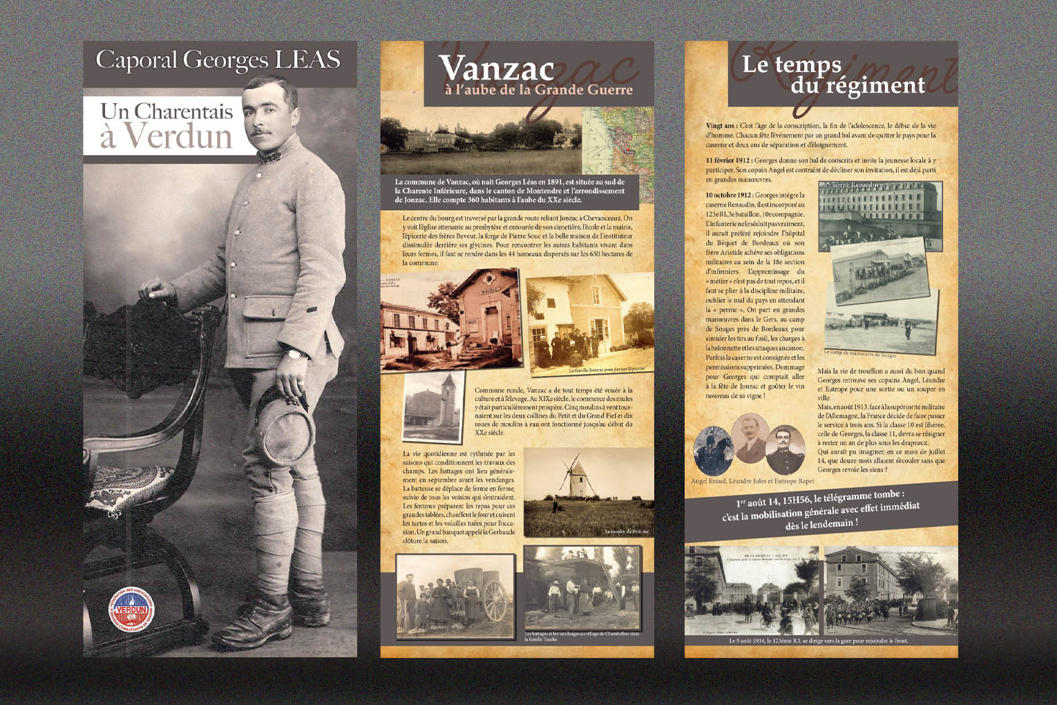
Un Charentais à Verdun exhibition (France)
Visual identity
A project in mind?
Let’s create something memorable
*monday-friday / 8.00-17.00 / Luxembourg time

FAQ
Everything you need to know before we get started. Your question isn’t covered here? Just ask us.
A logo marks a single entity that stays the same for years. This is closer to building a temporary world around a specific moment, a festival, an exhibition, a one time event. We develop a visual language, colors, imagery, typography, sometimes a mascot or icon system, that captures what that particular edition is about, then apply it across everything the event touches.
We start by building a small set of core elements, a color palette, a typographic pairing, a graphic pattern or motif, then define how they adapt to each format rather than designing every piece separately. That system is what lets a ticket, a banner, and an Instagram post all read as the same event without repeating the exact same layout.
Most recurring events keep something fixed, a name treatment, a core color, a signature shape, while letting everything else evolve. That balance is worth deciding early, a full reinvention gives you novelty, but it can also mean losing the recognition past editions have already built.
We work backward from the date rather than a standard project timeline, then flag the highest risk deliverables first. Tickets and early promotional material typically need to be ready long before signage and on site materials, building in that order protects the parts of the identity people see first.

You might also like…
Let’s work together!